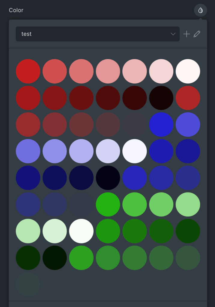
By default, Advanced Themer provides a 7-columns grid inside the Bricks color popup. It looks like this:
You might want to customize the number of columns and the gap between each color. Let’s see how to do that!
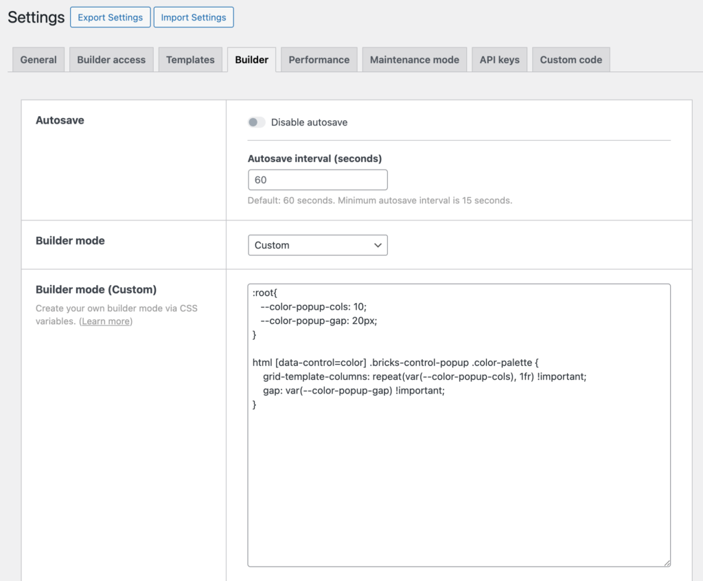
Set the builder mode to Custom
Bricks gives you the ability to add custom CSS inside the builder without affecting the frontend.
To do that, navigate to Bricks > Settings > Builder > Builder mode and choose Custom.
Save the settings and reload the page: you’ll now see a new textarea where you can add your custom CSS.
Add a custom CSS snippet to the builder
Paste the following CSS Snippet inside the textarea and save the settings again:
:root{
   --color-popup-cols: 10;
   --color-popup-gap: 20px;
}

html [data-control=color] .bricks-control-popup .color-palette {
    grid-template-columns: repeat(var(--color-popup-cols), 1fr) !important;
    gap: var(--color-popup-gap) !important;
}
In this example, the popup color will now contain 10 columns with a gap of 20px:

Feel free to modify the variable values inside :root() to fit your needs.