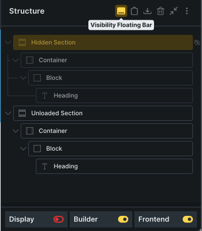
This small strip at the bottom of the Structure Panel is a real time-saver—it gives you a quick overview of an element’s visibility settings at a glance. It also includes handy toggles to apply display: none, hide the element in the builder only, or unload it from the frontend.
Release 3.3
July 16, 2025
37 changes
Bricks 2.0 Compatible & UX Enhancements
In version 3.3 we focused heavily on compatibility and usability:
First and foremost, Advanced Themer is now fully compatible with Bricks 2.0, ensuring seamless integration with the latest features and builder enhancements. This version is not compatible with previous releases of Bricks, so make sure to update the Bricks theme when using this version of AT.
Browser-Based UX Preferences
We’ve moved core UX settings—such as structure tweaks, shortcuts, and panel behaviors—into your browser’s LocalStorage. This means a faster, more intuitive experience:
- Settings persist instantly after any page reload.
- No more cluttered database; your server remains lean.
- Personalize your experience without affecting other users on the same site.
Brand-New Structure Menu
Meet the Structure Menu, your go-to hub for all structure-related tools. From here you can:
- Open AT modals like the Structure Generator or Structure Helper
- Toggle structural states (Tag Manager, StickyCSS)
- Activate UX tweaks (style indicators, right‑click shortcuts)
- Manage which structure icons appear in your panel header
Everything here is stored in LocalStorage—so tweaks stay exactly how you want them, without touching your database.
Breaking Changes
This release introduces a few important breaking changes to align with Bricks 2.0 and the updated UX logic:
-
Hide/Remove Settings:
If you previously used AT’s custom Hide/Remove options, make sure to convert them to Bricks’ new native properties using the converter found under Theme Settings > Global Settings > Converters. -
Topbar Icons Reset:
Your topbar shortcuts will be reset to their default configuration. You can now manage and customize them directly from the revamped AT Main Menu. -
Structure Tweaks Reset:
Your structure-related tweaks and icon shortcuts will also be reset. All of these can now be configured via the new Structure Menu, with changes saved in LocalStorage for persistence.
NEW
Visibility Floating Bar
NEW
Structure Menu
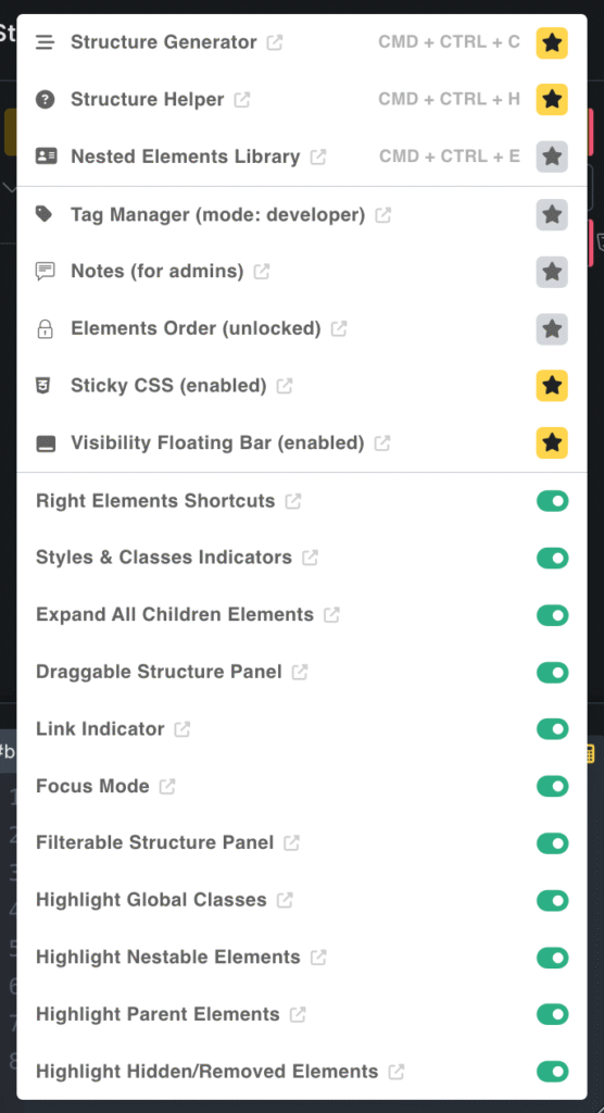
The Structure Menu is your central hub for managing all tweaks related to the Bricks Structure Panel. From here, you can open structure-related modals like the Structure Generator, Structure Helper, and more. You can control structure-state tweaks such as Tag Manager and StickyCSS, as well as enable UX improvement tweaks like Style Indicators, Right Shortcuts, and others. You can even customize which structure icon shortcuts appear in the Structure Panel header. All settings are saved to LocalStorage, so your preferences persist across page reloads without affecting your server database.
NEW
Highlight Hidden/Removed Elements
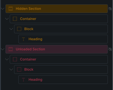
Bricks 2.0 introduced native options to hide elements in the builder or unload them from the frontend. While applying these settings is straightforward, it can be tedious to identify which elements are hidden or unloaded at a glance. This tweak adds subtle color cues to the Structure Panel, making it instantly clear which elements are affected.
FIX
Extended Variable Categories inside the Variable Picker are saved in the localStorage for each element
When you apply a variable to any builder control using the AT Variable Picker, the expanded category of that variable is saved in LocalStorage. This means that the next time you reopen the Variable Picker on the same control, the previously selected category will automatically be expanded by default.
FIX
UX Options stored in LocalStorage V1
Many AT options are now stored in your browser’s LocalStorage instead of the server’s database. Why?Because this approach simplifies the Theme Settings panel, which can be overwhelming for many users. It also helps in several key ways: These LocalStorage options are strictly related to the UX inside the builder. They have no impact on your…
FIX
Link Spacing Controls: persistant for all controls during the current session & on builder reload
The "Link Spacing Controls" tweak has been renamed to "Persistent Link Spacing Controls."When enabled, changing the link type on a spacing control (e.g. unlinked, opposites, or all) will persist across all similar controls — even after reloading the builder.
FIX
Visibility Floating Bar is now suppporting the native hide/remove settings of Bricks
The Visibility floating bar at the bottom of the structure panel was previously used to modify Advanced Themer’s custom Hide/Remove settings. Now that Bricks 2.0 includes native Hide/Remove functionality, the floating bar has been updated to control Bricks’ built-in visibility settings instead.
FIX
Lock ID Style is now integrated with Quick Access Tab of Bricks
When the "Lock ID Style" tweak is enabled, the styling tabs in Quick Access are grayed out and disabled until the lock is removed.
FIX
Grid Builder: now use the native Grid icon as trigger
AT no longer adds its own grid icon next to the Display control. Instead, if the tweak is enabled, it now leverages the native grid icon introduced in Bricks 2.0.
FIX
Right Shortcuts Sibebar: restyled to match 2.0 design
The Right Shortcuts Sidebar has a new look to match the overall Bricks 2.0 styles.
FIX
Right Shortcuts Sibebar: adding a section will automatically activate the left element tab
Previously, adding a Section element from the right shortcuts sidebar didn’t automatically open the left element panel — now it does, as expected.
FIX
Box-shadow Generator: compatible with bulk edits
You can now apply complex box shadows to multiple elements at once using the new bulk editing feature introduced in Bricks 2.0.
FIX
Quick Remove Template: generate random element ID’s on import to avoid builder conflicts
When you add templates to your page using the Quick Remove Template modal, all elements are assigned brand-new IDs to prevent potential builder conflicts caused by duplicate IDs.